A Carbonization Analysis
October 28, 2023
Climate change is an increasingly pressing issue, and rightfully so. The rising of global temperatures is leading to disastrous circumstances: melting glaciers lead to rising ocean water levels, which lead to less land for plants and mammals to cohabitate. With more ocean, and thus, less land, the world's food supply is under increasing amounts of pressure. This pressure is debilitating and the main culprit is human-caused Carbon Dioxide (CO2) emissions. Industrial activity produces CO2 and emits it into the atmosphere, which in turn traps heat radiating from the sun. In short, CO2 production raises global temperatures, which has harmful and disastrous consequences. Because of this, we want to minimize CO2 production. This mission conflicts with immediate profits for businesses so it has been met with strong resistance. However, as we will see in today's analysis, most countries, especially in the last decade, have begun to decrease their CO2 production. There are many credible online resources for you to learn more about this threat - my personal favorite is the National Resources Defense Council (NRDC). Let's jump in.
A Look Behind
Today's data is generously provided by the United Nations Development Programme (UNDP). The data contains many different metrics, but to start we are going to focus on only three: CO2 production, Human Development Index (HDI) code, and country.
HDI measures a country's social and economic development. It is a metric that combines information on citizens' quality of life, defined as the normalization1 of life expectancy, education, and income. CO2 production is measured using the Carbon Emission Intensity (CEI) metric, defined as the amount of CO2 emissions per unit of GDP. For more information and a collection of intriguing visuals, check out UNDP's article.
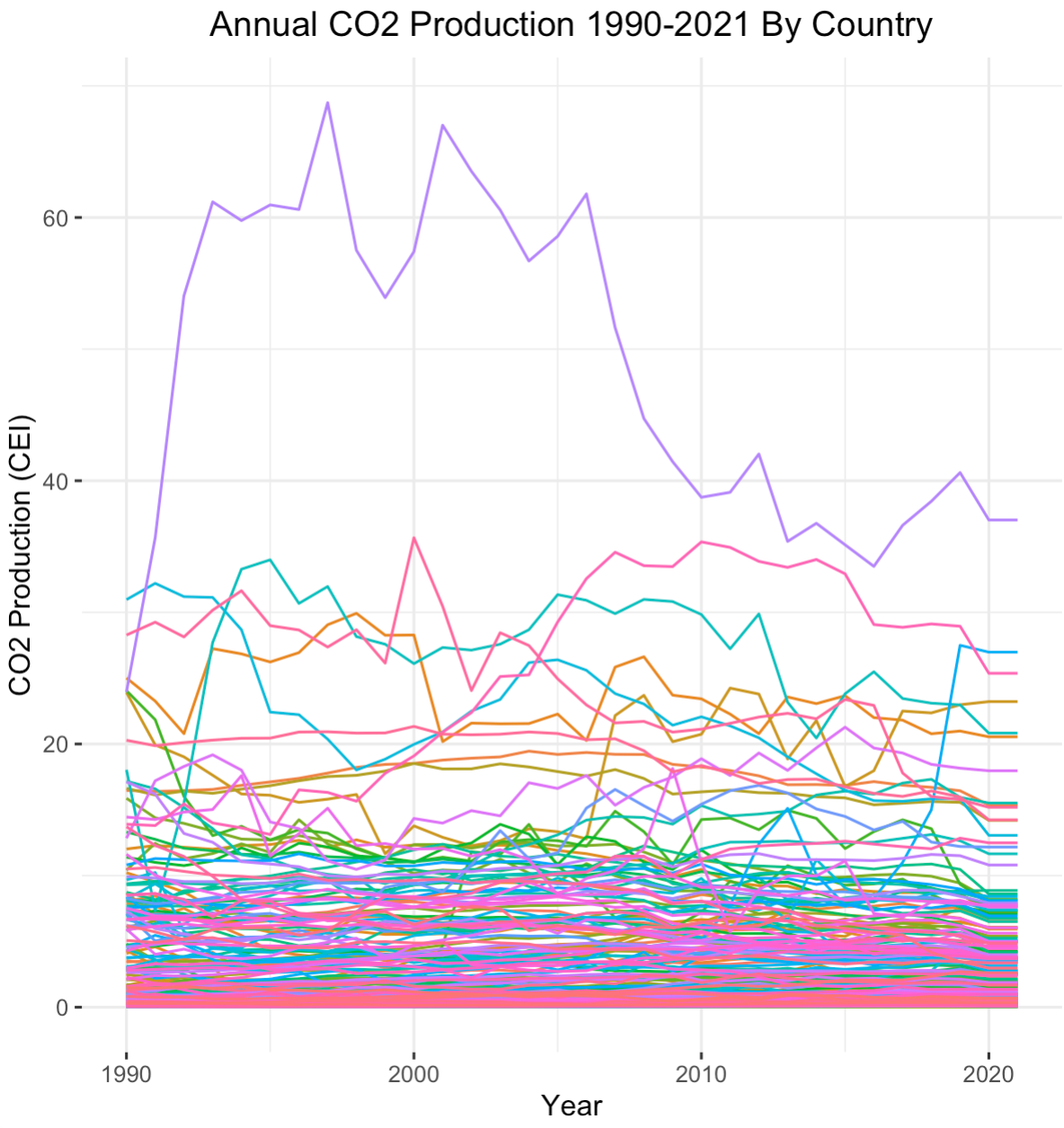
Let's begin by taking a zoomed-out look at CO2 emissions data. The data contains observations for all 195 countries around the world. We plot the annual CO2 production for each country from 1990 to 2021.
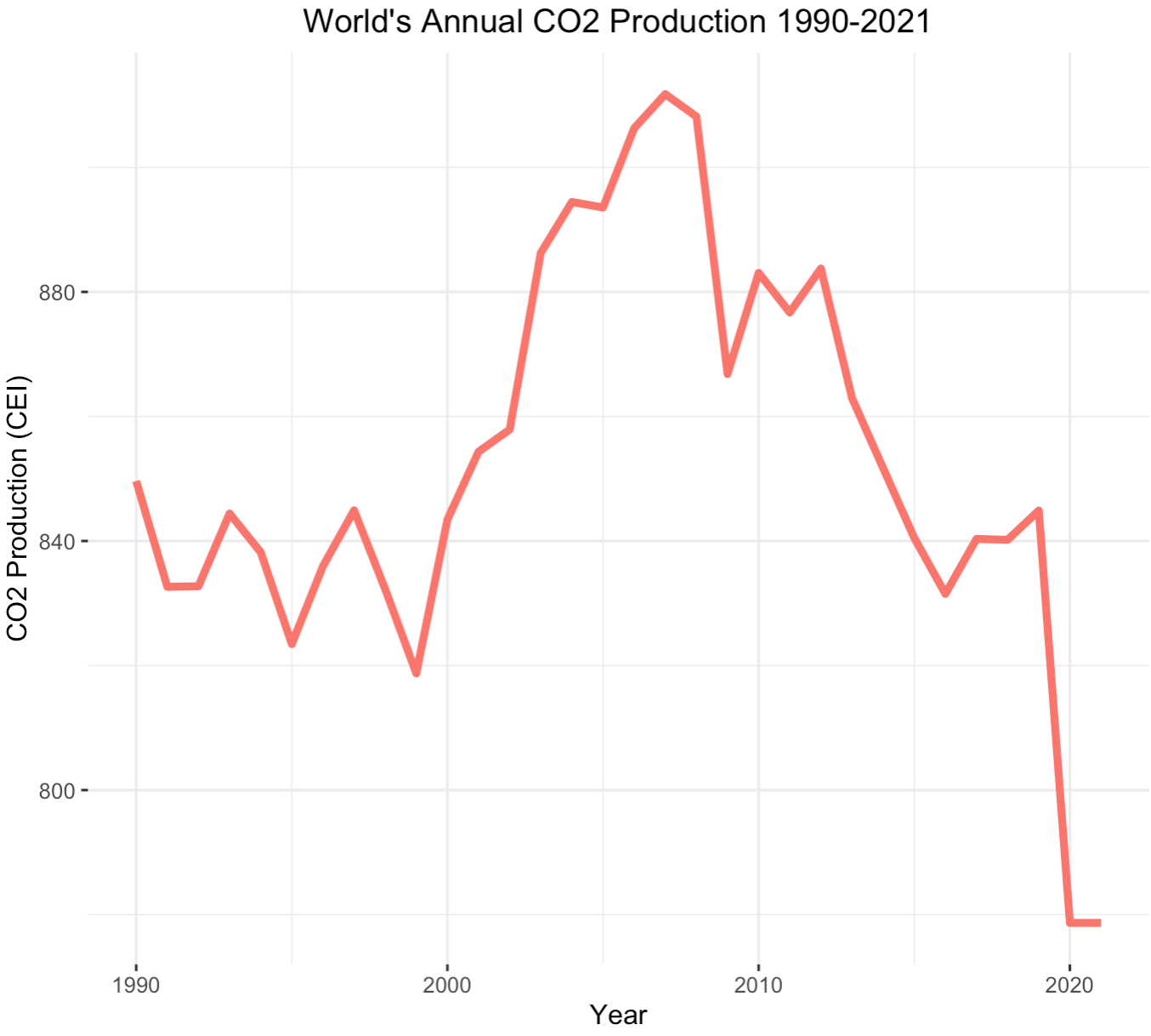
Focusing on the world graph on the left, you'll notice the sharp decline in carbon emissions that occurred in 2020 and 2021. The global COVID-19 pandemic is the reason for this - impeding industrial activity
and drastically lowering energy demands. This sudden drop will cause issues when we predict future carbon emissions since it is such a particular occurance,
we refer to these as leverage points, but more on this later.
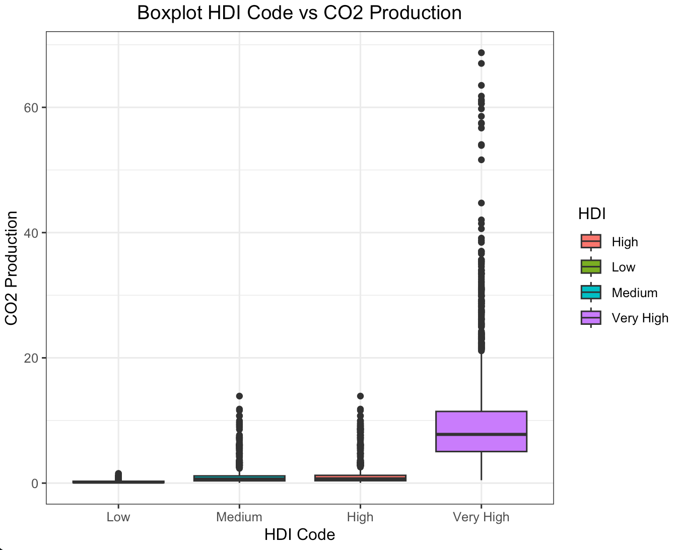
The graph to the right is a bit cluttered. To add clarity, let's partition each country by their HDI code. Remember, HDI measures the social and economic health of a country's population, so high HDI values indicate healthy populations.
HDI code categorizes these values into four groups: low, medium, high, and very high. Take a look.
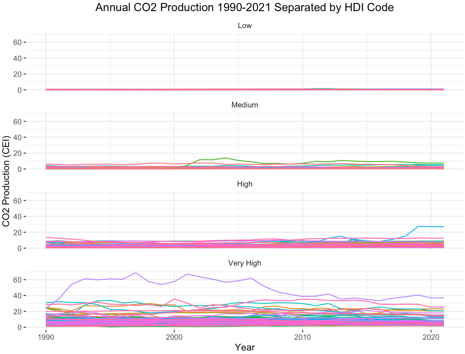
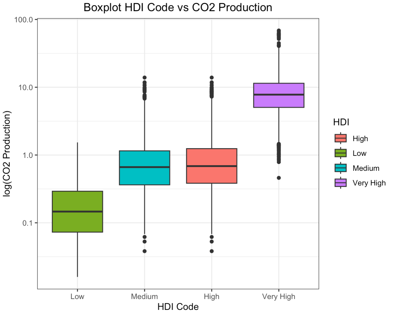
In the boxplot to the right, CO2 production is set to a logarithmic scale. The line plot to the left shows CO2 production with no transformation applied. A boxplot without a logarithmic transformation applied is placed in the appendix.2
The glaring first impression from these two graphs is that countries with higher HDI codes have higher levels of CO2 production. This shouldn't come as a surprise. As countries develop, their populations grow and economies flourish. With more people comes more business and higher energy demands. The main byproduct of non-renewable energy is CO2. If we run a Pearson's Correlation Coefficient Test, we see that HDI codes have a high positive correlation with CO2 production3. Interestingly, the average lifelong carbon footprint for a person in the United States is 16 tons, compared to the worldwide average of 4 tons4. Let's filter out the countries with relatively negligible CO2 production to expose the top emitters.
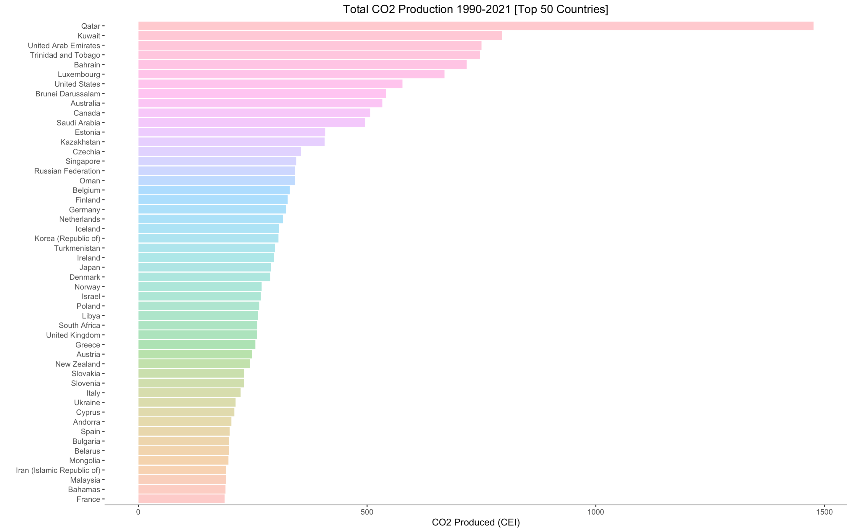
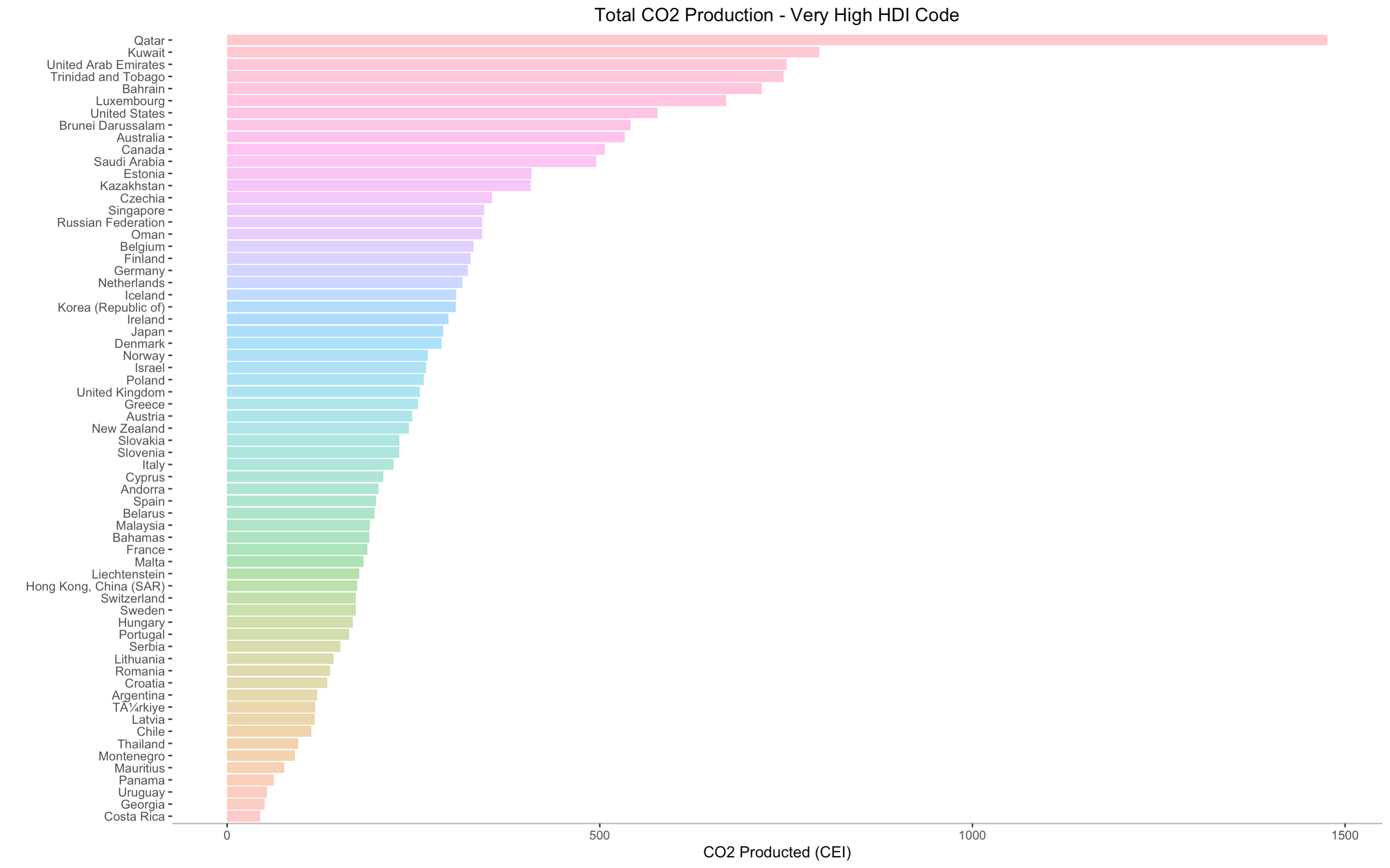
Above, we see the cumulative CO2 production for the top 50 countries - the sum of all the CO2 produced by each country
from 1990 to 2021. The main purpose of this graph is to shed light on the world's top cumulative CO2 emitters in the past three decades.
Qatar is, by far, the leading carbon emitter in the past three decades, nearly doubling the emission of its successor, Kuwait.
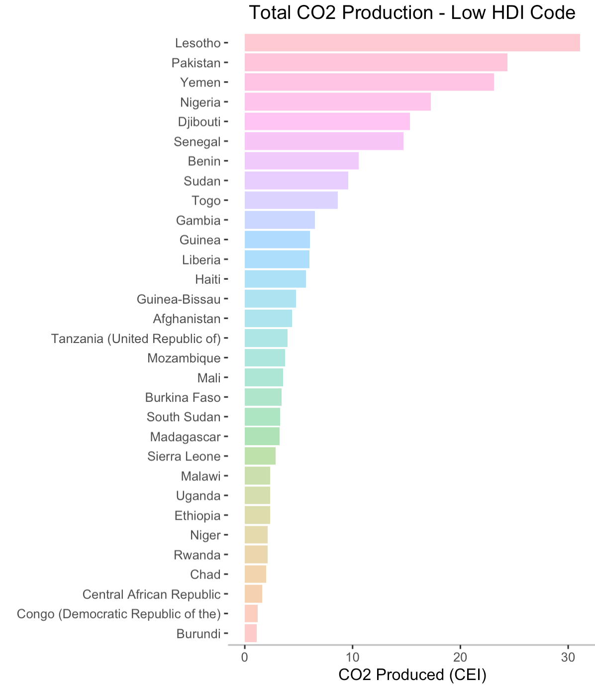
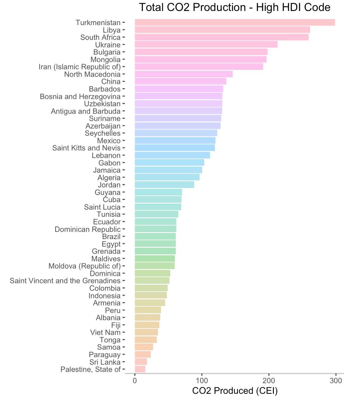
I've included barplots displaying all of the countries' production totals in the appendix5, where each plot shows the CO2 emitters for each HDI code in descending order. I think now is a good time
to provide another perspective - one that, perhaps, portrays a more inspiring story. We will now look at the rate at which CO2 production has changed in each country - whether production
has increased or decreased and, if so, to what magnitude. This is shown below.
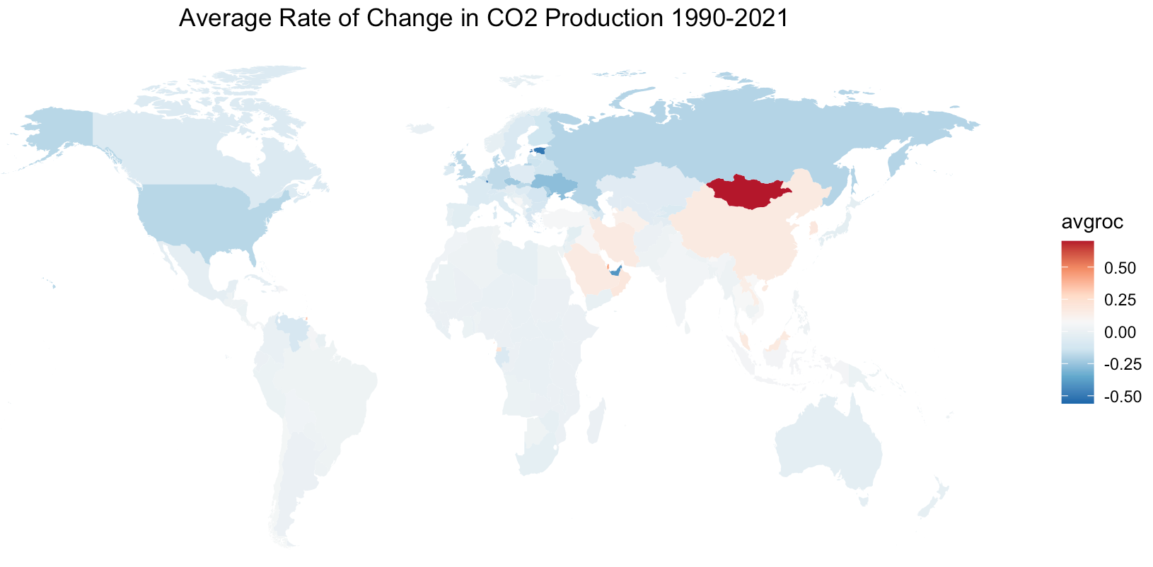
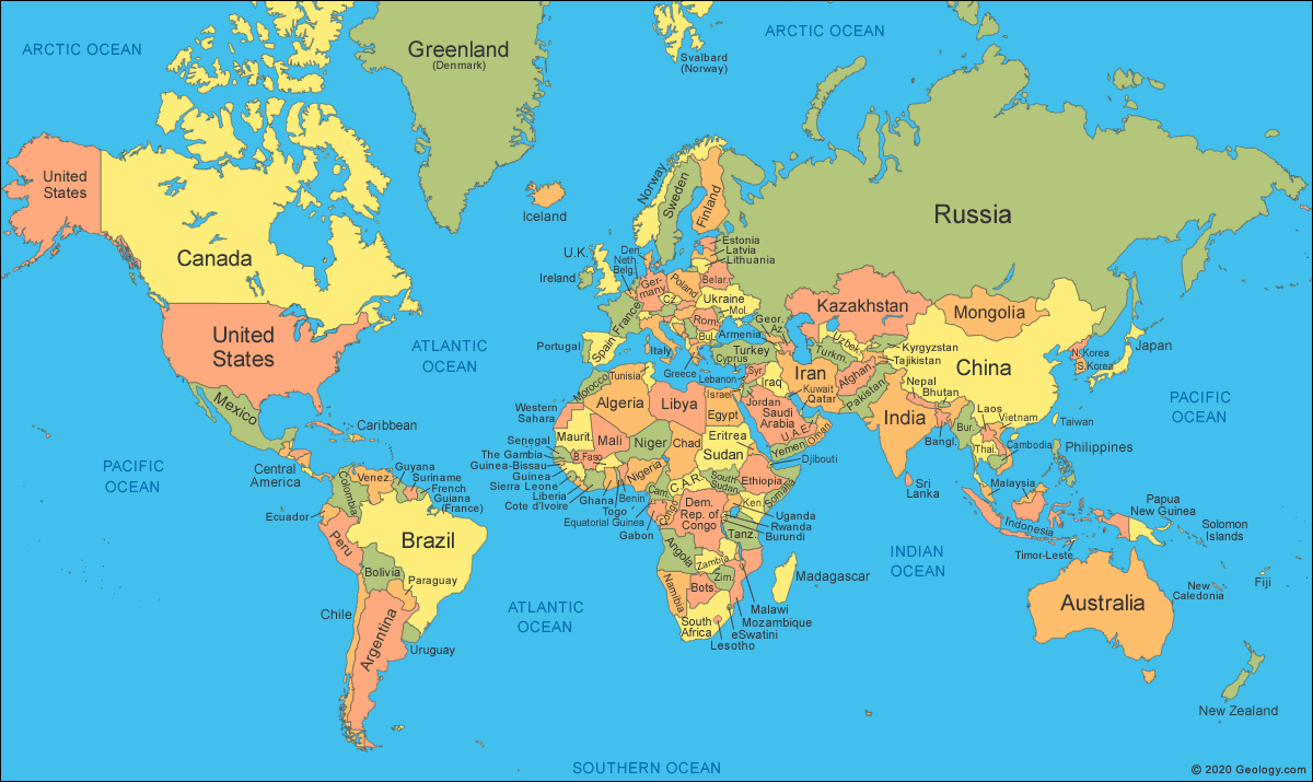
"avgroc" is defined as the average rate of change. Positive values (red) indicate an overall increase in CO2 production, while negative values (blue) indicate a decrease in CO2 production. I've provided a labeled world map6 in the appendix for your reference. A line graph7 is included in the appendix to provide a more detailed story of the top emitters' CO2 production during this time span.
This is a revealing graph. The countries that have the highest overall rate of increase in CO2 production are: Mongolia, China, Saudi Arabia, Qatar, and Iran. The countries that have the highest overall rate of decrease in CO2 production are: Estonia, United Arab Emirates, Luxembourg, Ukraine, United States, and Russia. I underlined the two aforementioned metrics because I want to emphasize the meaning of these claims: CO2 production rate refers to the change in CO2 production, spanning over 32 years from 1990 to 2021. For there to be a rate of change, the average CO2 production must either increase, decrease, or stay constant. For example, the United States has a decreased rate of change because less CO2 was produced in 2021 than in 1990.
Interestingly, all of the countries with the highest rate of decrease are among the top 50 emitters, three of which being in the top 7, namely United Arab Emirates, United States, and Luxembourg.
As noted in the introduction, CO2 production poses a threat to our habitable planet because it leads to rising global temperatures. Now that we've spent some time looking at CO2 production, we will now consider its relation to global temperatures. Starting simple, we plot the global average land temperature as a function of time. Fortunately, we have data going all the way back to 1875 that is generously provided by the National Weather Service.
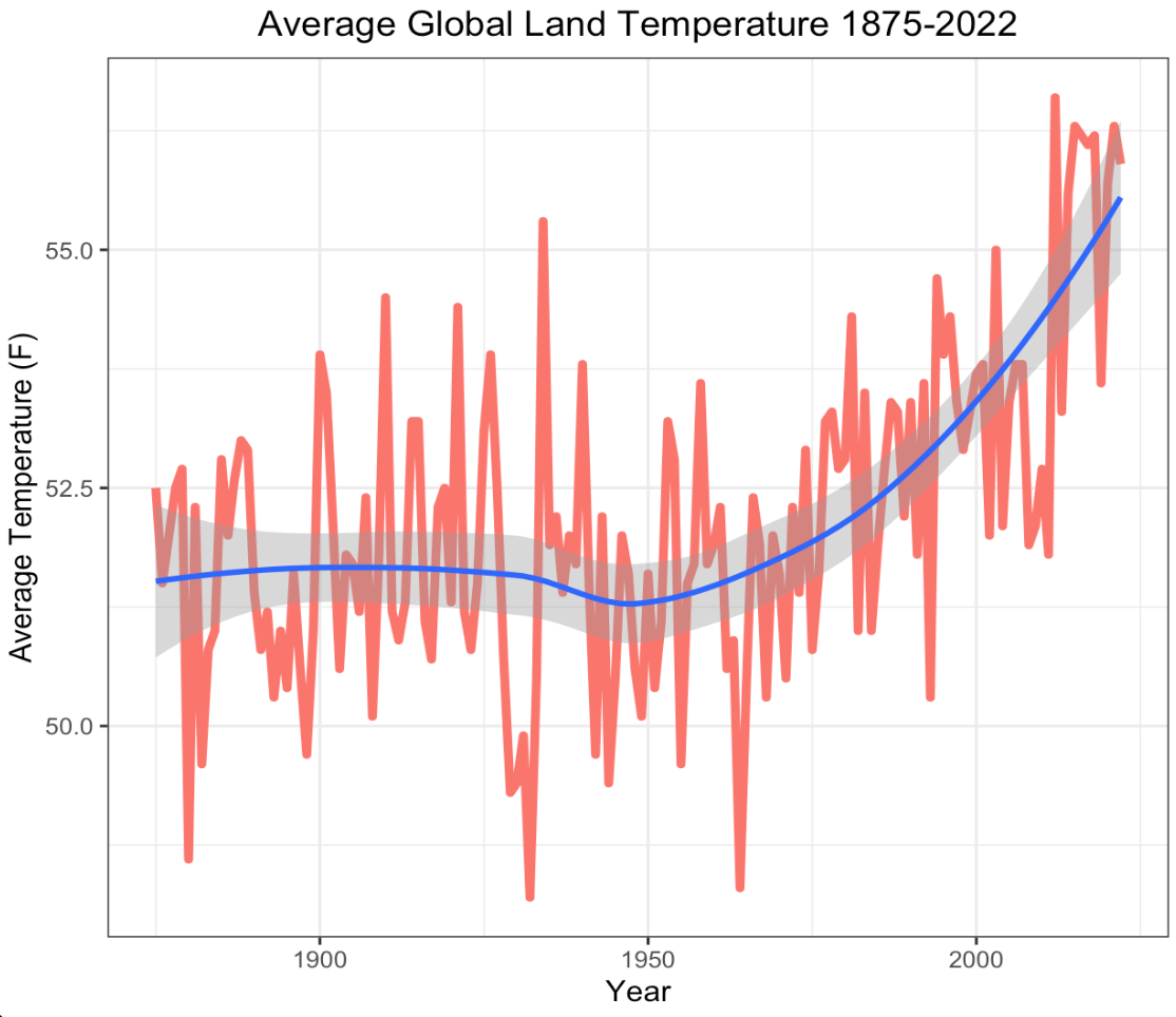
The red orange line tracks the observed temperatures while the blue line is the Locally Estimated Scatterplot Smoothing (LOESS) line with the associated confidence interval surrounding it. LOESS is a method that makes no prior assumptions about the structure of data and, as a result, has minimal bias involved in its smooth fitting procedure.As you see, from 1875 to 1950 the global average land temperature remained relatively constant at about \(51.6^{\circ} F\) . Starting around 1950 global temperatures began to increase exponentially, ultimately reaching their current level of \(55.9^{\circ} F\). This is an \(8.3\%\) increase in global land temperature. I'm not able to find credible data for CO2 production before 1990 so correlation analyses would be rendered moot. However, we can still apply regression techniques to forecast ahead and see what is to come if we continue operating as we have been.
A Look Ahead
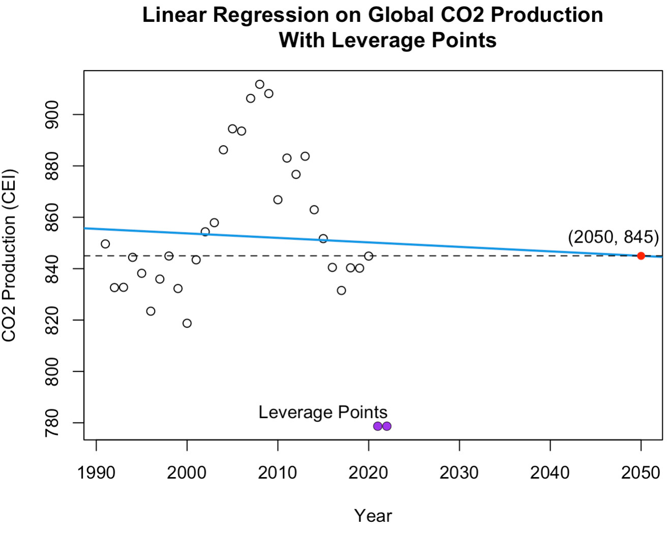
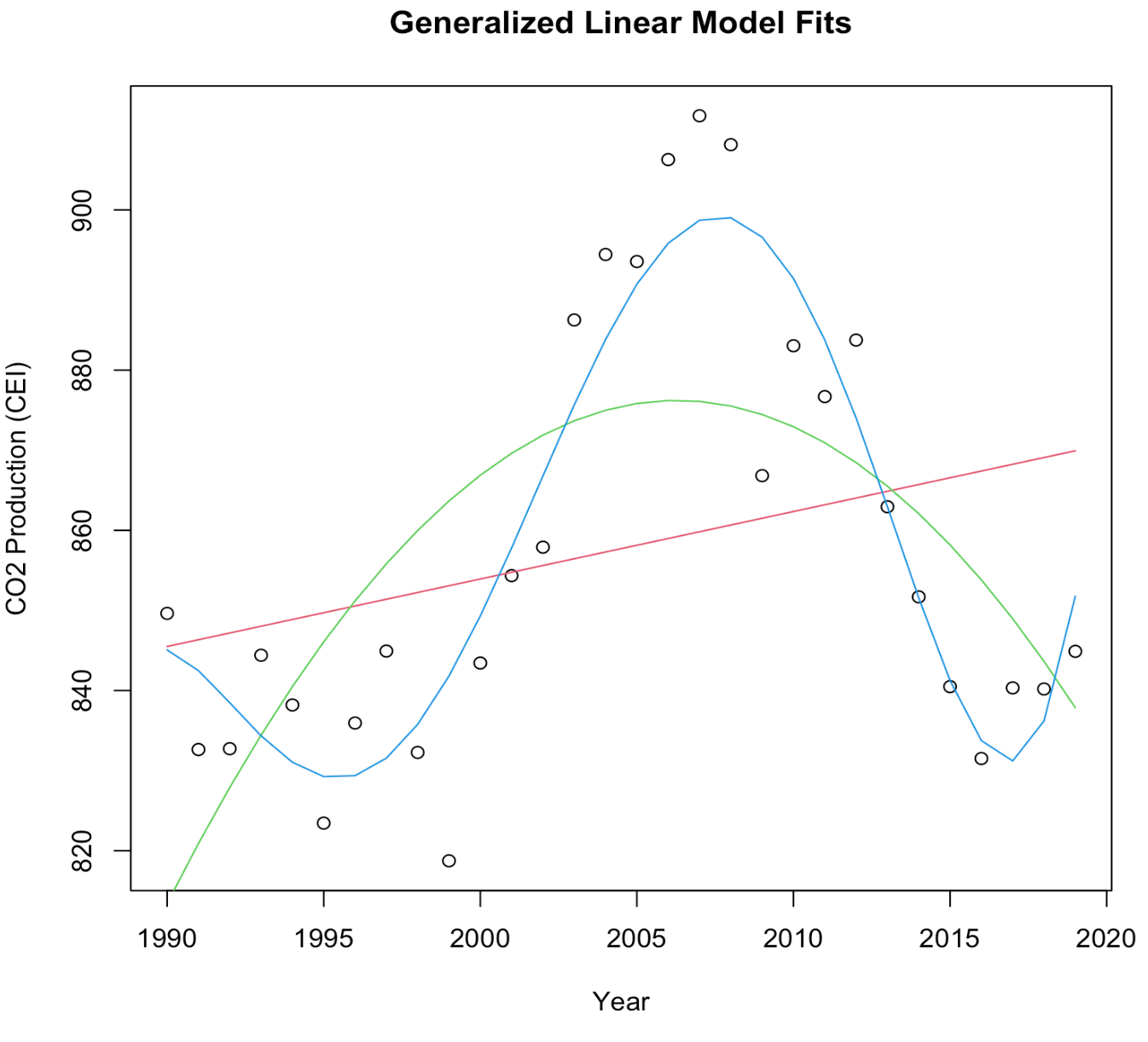
We now perform a regression analysis on the global CO2 production rates to predict future CO2 production in 2050. To do so we first need to acknowledge the lack of data points available. We have the average global CO2 produced each year for 32 years, so we have only 32 data points to train our model. Furthermore, amongst our data are two leverage points8 that should be removed to protect the integrity of our model. We remove these points and fit a linear regression model to the data, as shown below. The reason I decided to use a linear regression model opposed to some other model is because linear regression is often regarded as the most robust and reliable technique. Since we are working with so little data and predicting so far into the future, linear regression provides a basic regression model but one with strong fortitude. For a more detailed discussion on model selection and fitting procedures for regression, consider reading my article on Modeling Ethereum, in which I cross-validate an array of models to identify the optimal regression model. Other model types can be found in the appendix9.
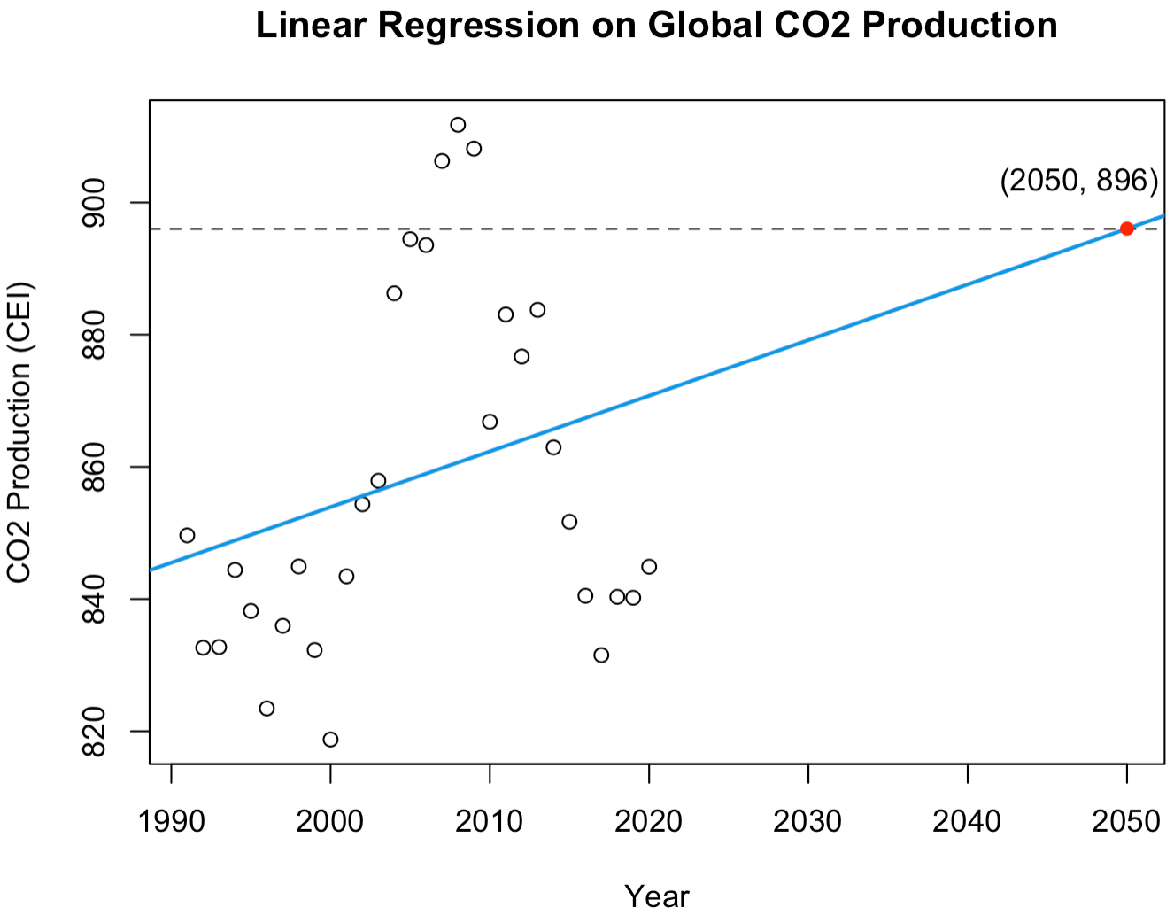
Applying our regression model to the CO2 data, we see that production will continue to steadily increase to 896 CEI by 2050, a \(5.5\%\) increase compared to 1990 production levels. Continuing forward to complete a regression analysis on the average global temperature data, we end up fitting a cubic function as our optimal regression model shown below.
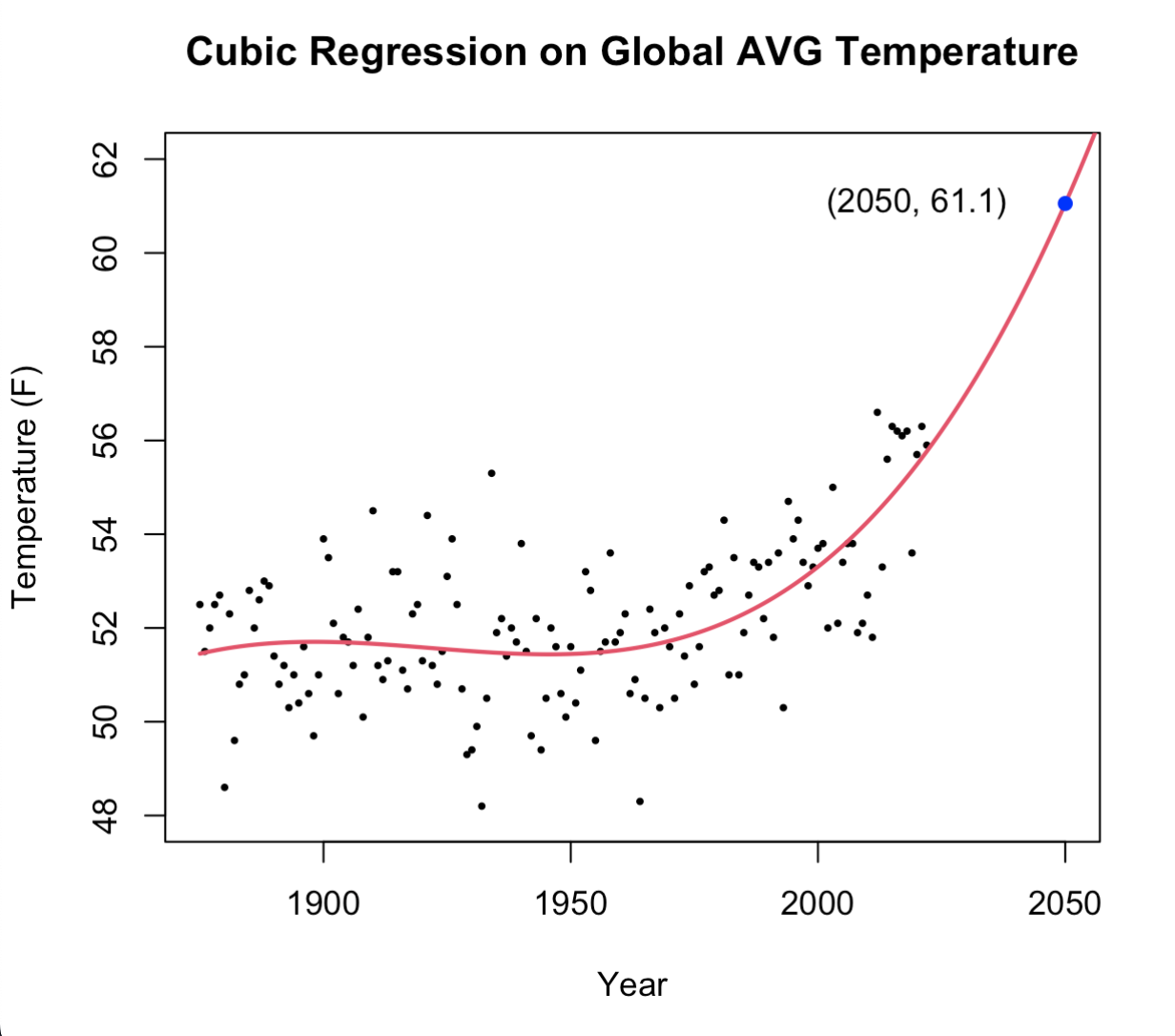
As is portrayed in the plot above, we see that if global temperatures continue on the path they've been following for the past 72 years, the global average land temperature will be \(61.1^{\circ} F\) by the year 2050. This is a \(9.3\%\) increase from 2022 and an \(18.4\%\) increase from the year 1950.
Closing Remarks
I'd be remiss not to say that this analysis is of my own doing and is not validated for truth by an official governing body. This article is not peer-reviewed, nor should it be trusted blindly. I did my best to site sources whenever I included claims that engendered from outside sources. I did my best to include evidence to back claims that came from my personal statistical analysis. I did my best to be thoughtful, careful, stringent, and cautious as I worked through this analysis. While I did my best, there are many others who have done better. There are tenured professors and passionate scientists who have dedicated their lives to this work and have written much more credible, reliable, and methodical research papers applying much more advanced statistical techniques than what I implemented here today.
The purpose of this article is three fold. First, to help me engage in research and, in turn, develop statistical acuity. Second, to raise awareness for climate change and the threat it poses. Third, to educate others on statistical methodology. The purpose of this article is not to spread misinformation, create controversy, or undermine the research of others.
Thanks for reading. I hope you were able to gain something positive from engaging in this article. Have a great day!
Appendix
- [1] Normalization and Euclidean Distance
To normalize is to find length (\(l\)) of a vector. In algebra class, we focus on Euclidean Geometry where we only deal with 2 dimensions - to find the Euclidean distance (length) between any two points on the same plane, we simply use the Pythagorean Theorem: \( l = \sqrt[2]{x_1^2 + x_2^2} \) , where \(x_1\) and \(x_2\) represent the horizontal and vertical distances between points. If we want to find the distance between two points in a 3 dimensional space, we would use a very similar formula: \( l = \sqrt[2]{x_1^2 + x_2^2 + x_3^2} \) , where \(x_1\), \(x_2\), and \(x_3\) represent the \(height\), \(width\), and \(depth\) between two points, interchangeably. Then, following this pattern to extrapolate and generalize to higher dimensions we obtain our generalized Euclidean distance formula: \( l = \sqrt[2]{x_1^2 + x_2^2 + ... + x_n^2} \) where \(n\) is the number of dimensions.
An example to help understand this concept is to consider a pair of skis in a box. You're traveling and need to store your skis in a box, but you don't know if your skis will fit. You want to find the maximum ski length that will fit in your box. This length will go from one corner, through the center, to the opposite corner (fitting the skis diagonally in the box.) Since there are 3 dimensions to a box (length, width, and height) we will use this formula: \( l = \sqrt[2]{x_1^2 + x_2^2 + x_3^2} \).
This is highly comparable to normalizing a vector since a vector is simply a line that connects two points with a specified direction. So to find the length of a vector, we just need to find the length between it's two endpoints. Just like when we had two points, vectors can live in a \(n\) dimensional Euclidean space. So the generalized normalization formula is nearly identical to the generalized Euclidean distance formula, but instead of using \(l\) to denote length we use \(\vec{l}\) to help us specify that we are referring to a vector's length like so: \( \vec{l} = \sqrt[2]{x_1^2 + x_2^2 + ... + x_n^2} \).
So finally, to calculate HDI we normalize a vector with dimensions: life expectancy, education, and income. The formula is: \( \overrightarrow{HDI} = \sqrt[2]{(life\text{ } expectancy)^2 + (education)^2 + (income)^2} \)
- [2] Boxplot of HDI Code and CO2 production with no logarithmic transformation applied
- [3] Pearson's Correlation Coefficient Analysis
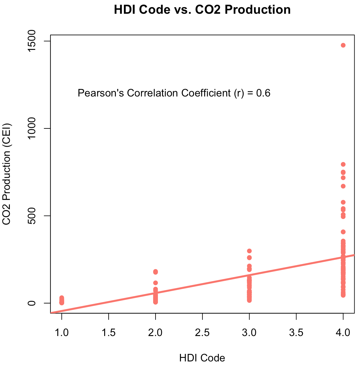
The line of best fit is drawn. Running Pearson's Correlation Coefficient Test, we see there exists a positive strong correlation between CO2 production and HDI Code with a coefficient \(\text{ }r = 0.6\).
- [5] Top Emitters Separated by HDI Code

[6] Labeled World Map
[7] Filtered CO2 Production Separated by HDI Code
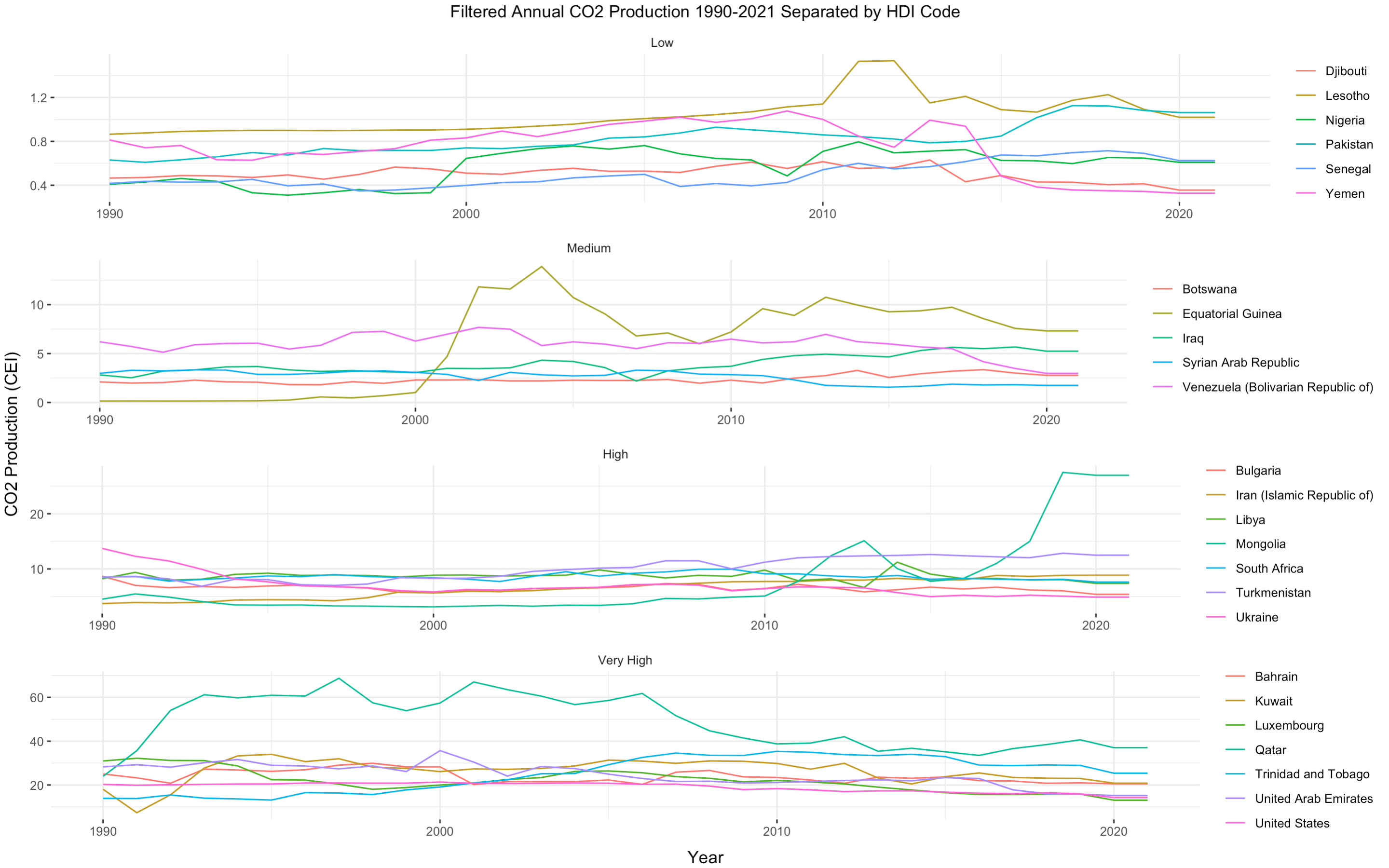
In an effort to mitigate erroneous conclusions taken from this plot, I want to highlight the different y-axis scales for each HDI category (low, medium, high, very high). For example, as displayed, the CO2 production range for countries with low HDI codes is [0, 1.4] while the range for countries with high HDI codes is [0, 70].
[8] Leverage Points
Leverage points, or "points of leverage," describe data that are so different from the rest of the set that they alter a model's fit an overly-abmitious amount. These are particular outliers in that they have too much power over the model. In this case, the observed CO2 production rates in 2020 and 2021 are considered leverage points because they are so drastically different from the rest of the data such that, if we take them into account when fitting a model, it would cause our model to predict erroneous claims. To resolve this, we remove leverage points from the data and continue as normal; thus, establishing a more reliable and robust forecast. A comparison is depicted in the two graphs below. On the left you see the regression line plotted when including the leverage points. On the right, you see the regression line plotted after we remove the leverage points. Note the difference that occures in each regression line when we only remove these two points of leverage, resulting in a completely different prediction model.
[9] Generalized Linear Model Fits
[9] Bar Chart Race